I need juicier interfaces
Flat design is easier to make, but I feel like we’re all malnourished from lack of lighting and ornamentation. I juiced up my site with more color, and even more fun lighting effects.
Is anyone else sick of flat design? Humans have a remarkable ability to interpret lighting, and we so rarely lean on that. Maybe it’s because I bounce back and forth between video games—where ornamental user interfaces are common—and enterprise software, where everything is a big flat labyrinth of shit. I know how much more fun we can have, and the web is absurdly powerful compared to the early days of CSS.
It feels like the moment we got gradient support in every browser, we stopped giving a shit about them! Of course, I blame Jony Ive and iOS 7 for this influence. Granted, iOS 8 was loaded with gradients on its home screen icons, but they were tacky and unimportant compared to the new drab white and blue aesthetic across the app interfaces (See this iOS 6 vs iOS 7 comparison for more).
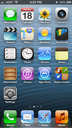
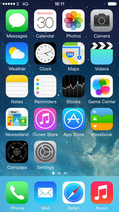
USA Today interviewed Jony Ive and Craig Federighi, who had some interesting quotes about the iOS 7 redesign:
Jony Ive: “When we sat down last November (to work on iOS 7), we understood that people had already become comfortable with touching glass, they didn’t need physical buttons, they understood the benefits,” says Ive. “So there was an incredible liberty in not having to reference the physical world so literally. We were trying to create an environment that was less specific. It got design out of the way.”
I feel like in hindsight this was either incredibly naive or genius. Juice is expensive to create. Why spend more time (which is money) tasking your designers with crafting lickable buttons, when they can spit out a fully flat rounded rectangle in seconds.
Craig Federighi: “This is the first post-Retina (Display) UI (user interface), with amazing graphics processing thanks to tremendous GPU (graphics processing unit) power growth, so we had a different set of tools to bring to bear on the problem as compared to seven years ago (when the iPhone first launched),” he says. “Before, the shadowing effect we used was a great way to distract from the limitations of the display. But with a display that’s this precise, there’s nowhere to hide. So we wanted a clear typography.”
I’m guessing by clear typography that Craig is referring to the razor thin text with insufficient background contrast that plagued iOS 7. The last iPhone I personally owned was the iPhone 6. It came out in 2014, about a year after iOS 7’s debut.
iOS 6 looked pretty tacky overall, especially the game center (🤢), but the reaction to that should’ve been refinement, not throwing everything away. I’ll admit that I thought Microsoft’s Metro UI was incredibly cool, and is the most stark text heavy flat design that had any decent popularity (at least under its bastardized Windows 8 variant that married existing Windows aesthetics and Metro UI like oil and water).
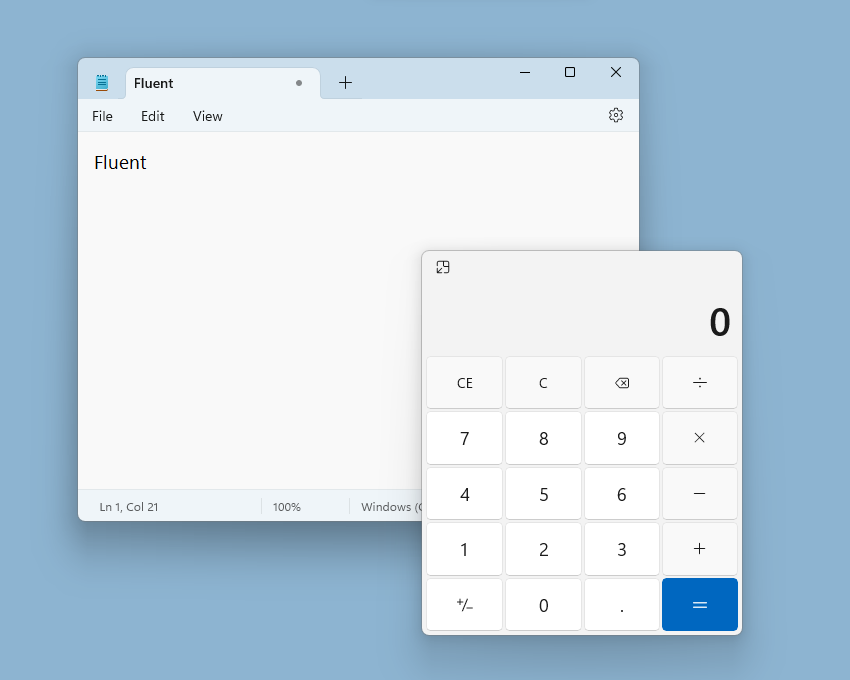
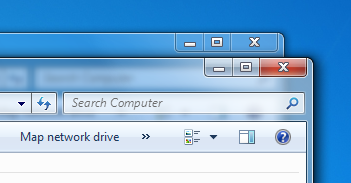
Both Aero and Fluent attempt to “get out of the way”, but Aero maintains shapes and lighting in a way that helps guide the user. Fluent has flattened everything and removed so many borders that nothing makes sense any more.
Anyway, this is all to say that one random little piece of my website’s UI, the gradient faded card, has inspired me to add even more “juice”. I worked hard on lighting approach that looks classy and functional. Lighting subtly draws your attention to where it needs to go, without needing big ugly bordered boxes everywhere. Despite all the squares, I think the gradients and partial borders keep it looking slick.
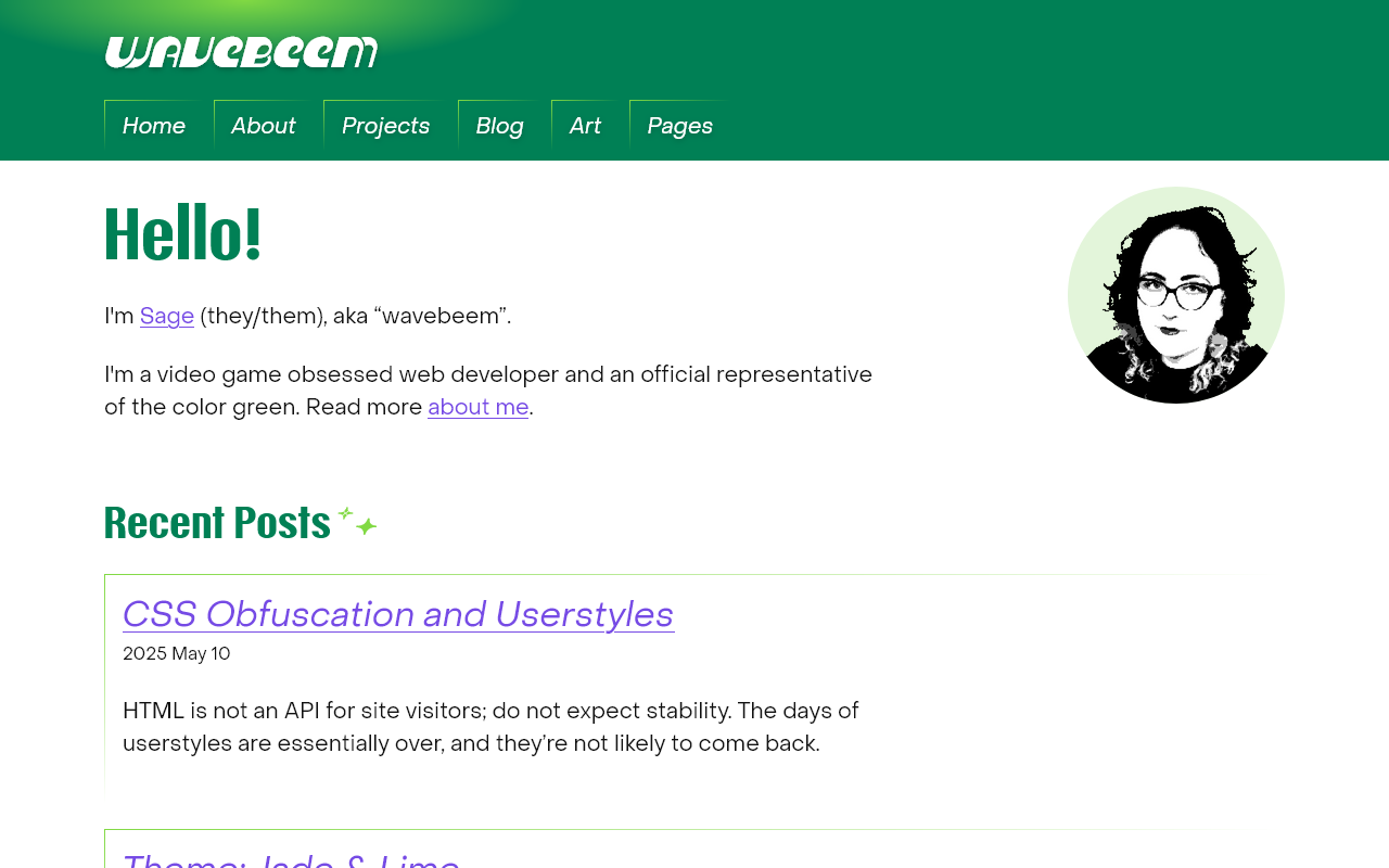
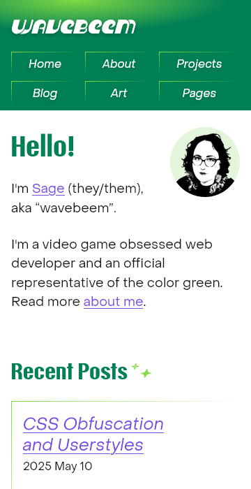
above the fold
This image shows how the “lighting” (a gradient background on the logo) casts its light onto the edges of the navigation
I wanted to include a few video game UIs I’ve looked at recently with some good “juice” to them.
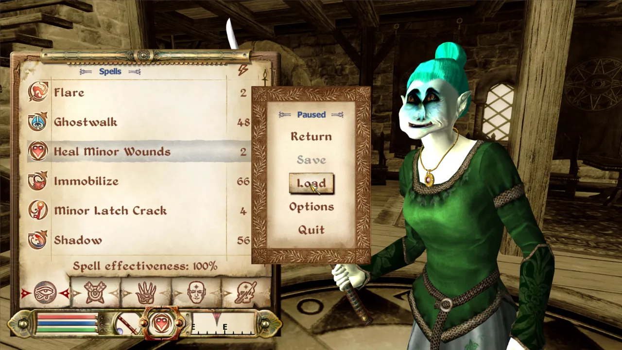
Strictly speaking the UI looks dry and dusty, but this is a kind of stone and parchment juice that gives Oblivion a lovely old timey feel.
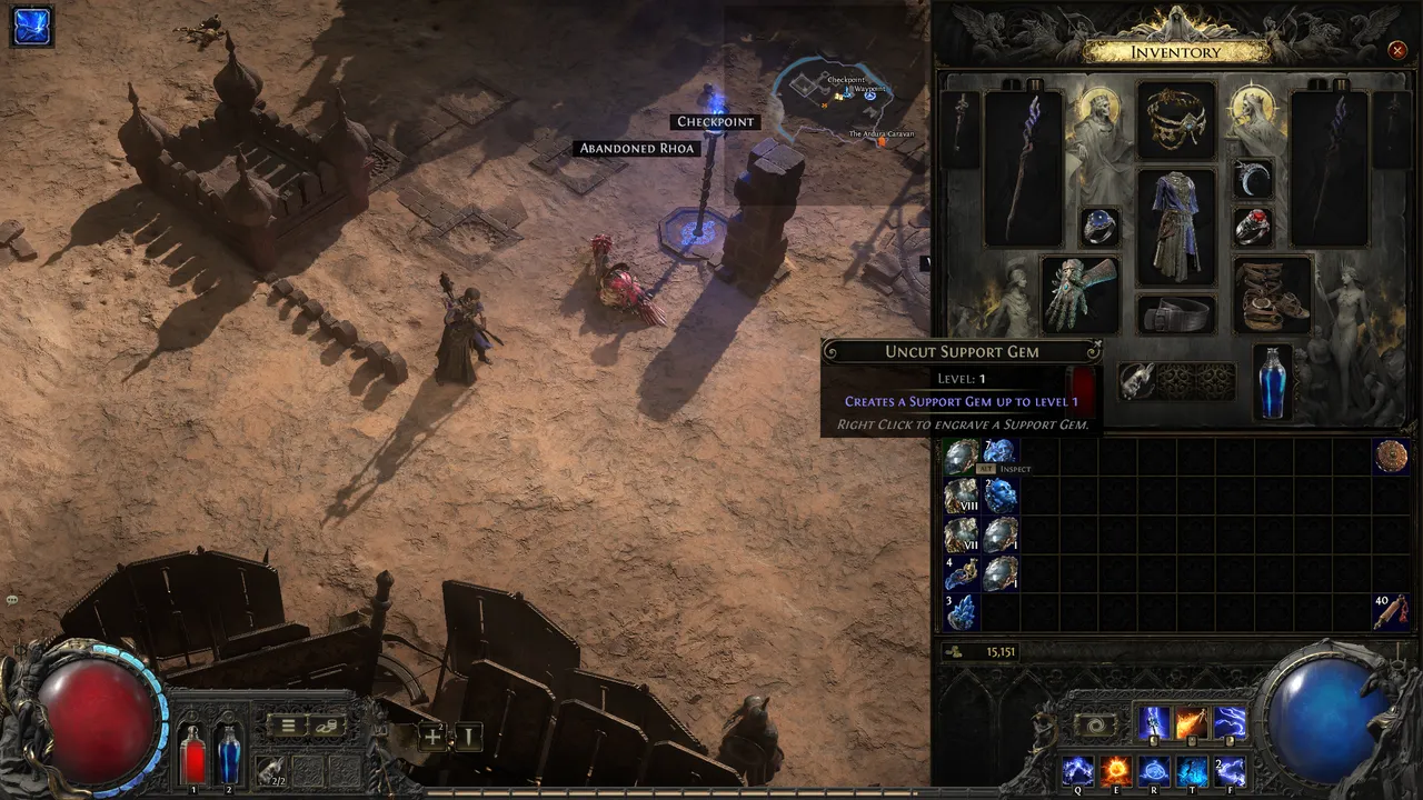
The mouse cursor emits a small light source that is lightly reflected by the UI elements… an incredible addition to this juicy UI.
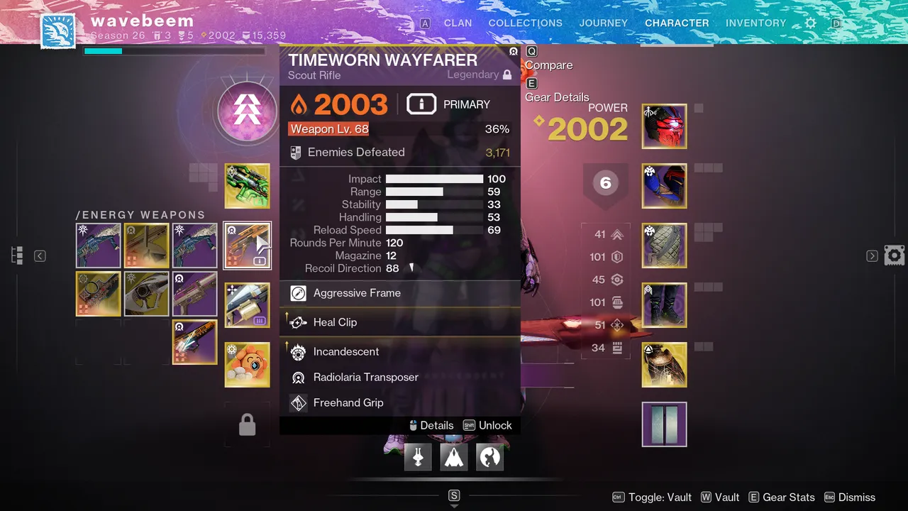
Destiny is actually pretty modern with its flat squares design, but even then we have little bits of juice, like ornamental textures, and gold borders that appear to be glowing. Perhaps subconsciously I was thinking of these boxes when I designed my cards…